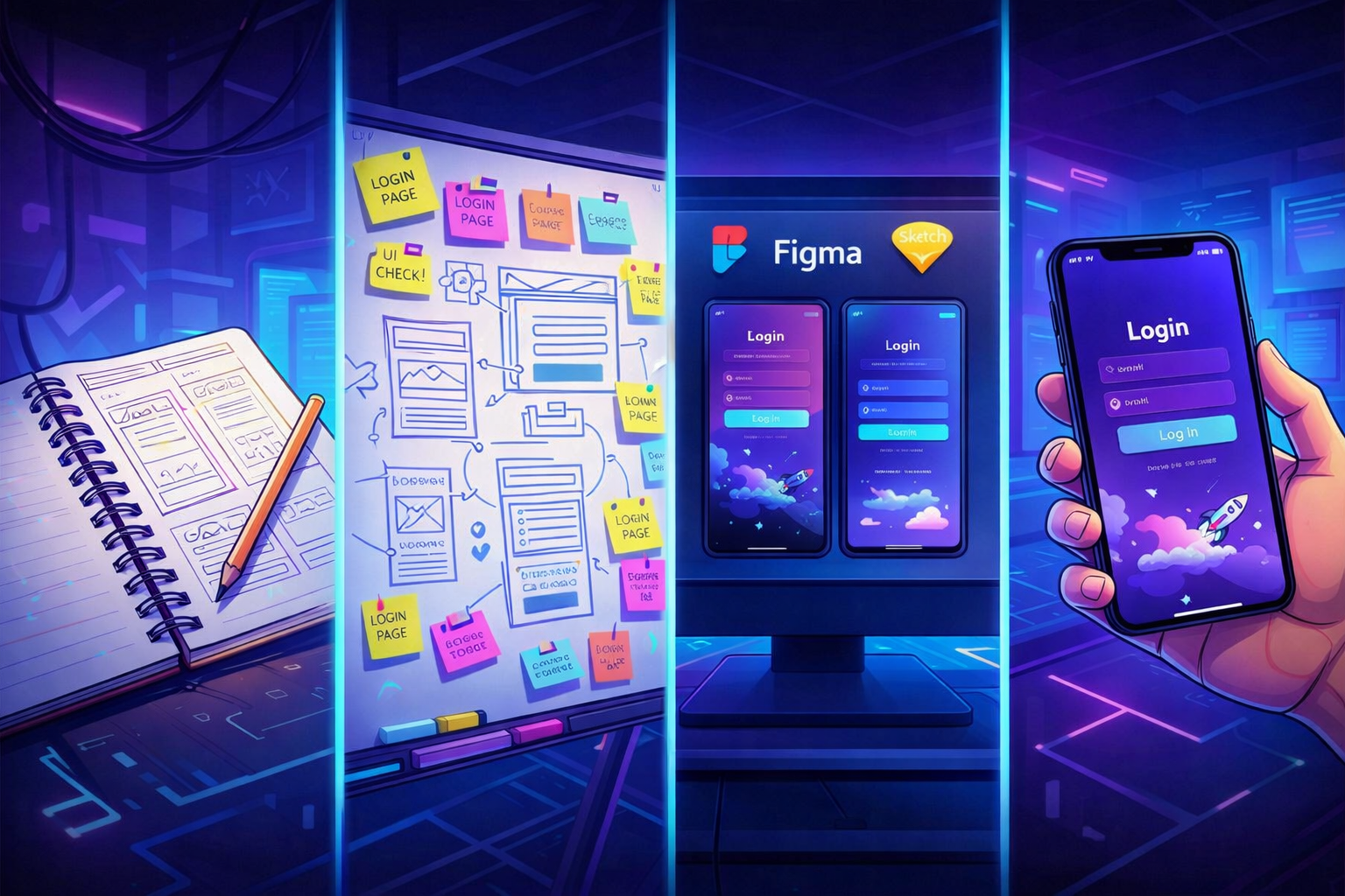
The look is pro. But your users drop off.
In part one, we covered the look & feel: empty states, errors, responsive, design, logo, icons, colors, images, micro-interactions, copy. Everything that makes an app look professional.
But looking pro isn't enough. The experience needs to be pro too. That's what makes the difference between a user who tries your app and a user who stays.
This second part covers three pillars often neglected in vibe-coded apps: performance, onboarding, and emails.
1. Perceived performance
Your app takes 3 seconds to load? The user is already gone. But real performance is what the user feels — and it doesn't only depend on server speed.
- Unoptimized images: AI never compresses images. Result: 3MB photos that take 5 seconds to load. Use WebP format, resize to the right dimensions, add
loading="lazy". - Skeleton loading: instead of a white screen during loading, show the page structure with gray placeholders. The user knows something is coming.
- Progressive loading: show critical content first (text, navigation), then secondary elements (images, widgets). The user can start reading immediately.
What you can do now: open DevTools (Network tab), check "Slow 3G", and browse your app. Anything that takes more than 3 seconds deserves your attention.
2. Onboarding
This is the most critical moment in your app. A user who signs up and doesn't understand what to do in the first 30 seconds... won't come back.
Vibe-coded apps often have the same problem: sign-up works, and then the user lands on an empty dashboard. No guidance, no direction. They're supposed to figure it out.
A prototype: sign up > empty dashboard > the user is on their own.
A product: sign up > the user is guided to their first "moment of value".
What good products do
A personalized welcome message. Not just "Welcome to [App]". Something that sets the direction: "You're 3 steps away from [concrete result]." The user should immediately know what they'll get and how to get there.
A guided first action. Don't let the user choose from 15 options. Offer them one single thing to do first. "Create your first project", "Add your first product", "Import your data". One button, clearly visible.
A progress indicator. "Step 1 of 3" or a progress bar. It's simple, but it changes everything. The user knows where they are and how much is left. It significantly reduces drop-off.
Pre-filled examples. Nothing worse than a form with 10 empty fields and no context. Show a concrete example. Pre-fill fields with sample data. The user understands the expected format and sees what the result will look like.
A useful welcome email. Not a generic sign-up confirmation. An email that reminds them of the first action to take, with a direct link. "You signed up — here's how to get started in 2 minutes." Many users sign up and only come back through that email.
Classic mistakes
- Too many fields at sign-up. Name, company, phone, address... The user hasn't even seen your product and you're asking for their life story. Email + password is enough to start. Ask for the rest later, when they've seen the value.
- A 12-step guided tour. Nobody reads it. Nobody finishes it. If you need 12 steps to explain your app, the problem is the app, not the onboarding.
- Zero emails after sign-up. The user signs up, closes the tab, forgets. Without a reminder email, you've lost a lead.
What you can do now: create a new account on your app. Time the gap between sign-up and the moment you do something useful. If it's more than 60 seconds, simplify the flow. Add a welcome message, a clear first action, and a welcome email.
3. Transactional emails
This is the most overlooked part of vibe-coded apps. And it makes sense — when you're building prompt by prompt, emails are the last thing on your mind. But for your user, an email is often the first or last touchpoint with your product.
A prototype: a plain-text sign-up confirmation sent from noreply@vercel.app. And that's it.
A product: a thoughtful email sequence with a real sender, a design consistent with the app, and a clear goal for each message.
The emails your app should send
The welcome email (D+0). This is the most important one. The user just signed up, they're still engaged. The email should do one thing: bring them back to the app for their first action. No wall of text, no feature list. A value reminder, a button, that's it. "You signed up for [App]. Create your first [X] in 2 minutes." + a big button.
The activation reminder (D+2 or D+3). The user signed up but didn't do anything? Follow up. Not aggressively — with a helpful angle. "You haven't created your first [X] yet. Here's an example to get you started." This email recovers 30 to 40% of sign-ups who had forgotten.
The feedback request (D+7 or D+14). The user has started using your app. Time to ask for their opinion. Not a 20-question survey — a single open-ended question. "What's the one thing you wish [App] had?" or "On a scale of 1 to 10, would you recommend [App] to a friend?". This feedback is gold when you're in launch phase.
Lifecycle emails. The user hits a milestone? Congratulate them. "You've created your 10th project — nice!" They haven't come back in 2 weeks? Remind them what they're missing. "You have 3 projects in progress — need a hand?" These emails show your product is alive and someone cares.
What separates an amateur email from a pro email
- The sender.
noreply@app.comfeels robotic.thomas@app.comfeels human. Use a real first name, even if it's automated. - The subject line. "Welcome to [App]" is generic. "Your first [X] is waiting" makes you want to open it.
- The design. No need for a complex template. A simple email with your primary color, your logo, and a clear button. Consistency with your app is enough.
- The timing. A welcome email 3 hours after sign-up is too late. Send it within a minute. The reminder at D+2, not D+15.
- The unsubscribe link. Legally required, but also a trust signal. A visible link at the bottom of every email.
Tools to get started
You don't need an email marketing platform to send 5 types of emails. Simple transactional tools are enough:
- Resend or Postmark for technical sending (reliable, good deliverability)
- React Email if you want to code your templates as components
- The built-in email system from Supabase or Auth.js for authentication emails
The most important thing is to start. A single well-crafted welcome email has more impact than zero emails.
What you can do now: sign up to your own app with a personal email address. Check what you receive. If the answer is "nothing" or "an ugly technical email in English", that's your priority for the week.
The full "prototype to product" checklist
You don't need to do everything at once. Prioritize what has the most impact for your users. This checklist covers both articles — the look & feel and the user experience.
Priority 1 — The essentials (do it today)
- Errors are shown in human language
- The 404 page is customized
- Forms validate fields and display errors
- Buttons have a loading state
- The app is usable on mobile
Priority 2 — The professional (this week)
- Empty states are designed with a call-to-action
- Onboarding guides to a clear first action
- A welcome email is sent within a minute after sign-up
- A reminder email is sent at D+2 if the user hasn't taken action
- Logo is readable at 32x32 and in black and white
- One icon set only (no emojis or AI images)
- Max 2 colors + black/white/gray (90% rule)
- Spacing is consistent
- Text is in natural language (not "Submit" / "Error")
- AI images are replaced with real photos (Unsplash, Pexels)
- Images are optimized (WebP, lazy loading)
- Delete actions ask for confirmation
Priority 3 — The polish (when the rest is done)
- Transitions and animations are smooth
- Skeleton loaders replace white screens
- Hover/focus states are in place everywhere
- Performance is tested on 3G
- A feedback request is sent at D+7
- Lifecycle emails mark milestones
The result
Combine the professional look with a polished user experience, and your app no longer looks like a prototype. It looks like a product people take seriously — and are willing to pay for.
If you want an outside perspective on your app before launch — check out the Audit offer. We review every item on this checklist, identify quick wins, and give you a concrete action plan.
Subscribe to the newsletter to get tips like this one every week.